When my bro Ken decided to change his domain from What The Fat (here’s the theme I designed for him then) to something that he can use for a lifestyle blog, it took us weeks to come up with something we’re sure he’d stick with for a long time. And one afternoon, while we were on our way to somewhere (I can’t remember where we were going), we thought of Ken Avenue. Immediately, ideas for his blog’s design came rushing in.
I had big plans for the design, but Ken won’t stop searching for the theme he’d want to use or something I can get ideas from. That’s why I don’t have a screenshot of his old theme because before we finally settled in his current blog’s design, he switched to about probably 20+ themes. 😀
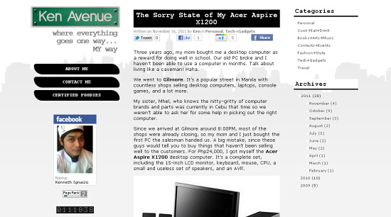
So, here’s the final layout:

He wanted a plain white background, a narrow main content area with 2 sidebars on its sides, and a mix of black, white and gray hues.
Since the blog looked a little bland because of the plain white background, I decided to design a simple image with a silhouette of New York. I know, it should’ve been Manila, but NYC is one of the cities we both want to visit sometime in the future so I just had to use it.

I created a logo for him that looks like a street sign. It was part of my original concept for his theme. I had to change it up a little (took out the pole, etc) after he decided to go for a minimalist design.

The byline was so right on – “Where everything goes one way… my way”. Seriously! We almost high-fived when we came up with these concepts. What a bunch of geeks, I know! 😀
I didn’t design any special navigation buttons for him since we both liked how those rounded corner looked like. 🙂
I just hope he’d have more time to update his blog. We’ve been thinking of hosting giveaways on his blog (we’ve got headsets and other geeky stuff), but we haven’t gotten to that yet ‘cause of his hectic schedule, especially now that we started his own business (you can still order his blueberry cheesecake!). Stay tuned! For now, you can follow Ken Avenue on Facebook or visit his blog.
What do you think of the design? 🙂
————————————————————————
I can’t wait to start working on Certified Foodies’ new blog design. Keep posted! 🙂
simple yet classy. it fits Ken’s personality 🙂