This blog is no longer up since he decided to move to a more general blog. It’s now Ken Avenue and you can see the design I made for that too.
My brother Kenneth and I are both bloggers. He doesn’t blog as much as I do, but only writes posts when he feels that need to share his thoughts. We’ve got different blogging styles, which I find amazing. He’s younger, but his vocabulary is wider than mine.
Anyway, this post isn’t really about him and his writing style :D, but the design I made for his new blog. I also purchased a domain for him – WhatTheFat.net – for his own personal space on the web.
The Domain / Blog Title
I remember Kenneth coming up to me one night telling me he wants to start a blog where he’ll write about his struggles in losing weight. After some wordplays, we finally decided on WTF – What The Fat. I immediately imagined how I wanted the design to look like.
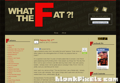
He was publishing on Blogger, but I later decided to move his blog to WordPress. It was after he decided to convert it to his own personal blog instead of just focusing on his weight loss journey. I moved all his old posts and, voila! Here’s the final layout:
The Colors
He wanted me to use the colors of his old blog. He prefers an earthy color palette and so I ended up using tan, beige, dark browns and gray.
The red color came from my idea for the header, using it to emphasize on the letter F. So, the color was used for parts of the theme that needed to be highlighted like the post title and sidebar titles.

The Header
The layout of the blog title on the header was conceptualized the moment we decided on that title. The rest of the concept came to me when he decided to make What The Fat his personal blog.
Again, the F is in red color to make it pop. And, if you look closely, the background of the header is actually filled with words starting with the letter F and are related to his weight loss journey and what Kenneth goes through in his personal life.

The Sidebars
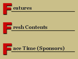
To continue with the concept of the letter F being one of the main focus points of the whole design, I made the sidebar titles like this:

Well, the hard part is thinking of other words for Sponsors (Face Time), Archives.(Fast Rewind), etc. But, I think we did a good job coming up with alternate words for the widget titles, don’t you agree? 😉
All in all, I’m pretty happy with the end result of my design. My bro loved it, too! I just wish he’d get to blog more often. 😀
Check out my brother Kenneth’s blog – What The Fat.
What do you think of What The Fat’s design?
Share your thoughts at the comments section.
I KINDA only welcome constructive criticism. LOL 😀
I’m still not done with the blog design for Joy of Notepad Corner. After her, I’ve got 2 more blogs on queue for makeovers. Then, I’ll post my rates and officially offer my services to all bloggers out there. 🙂

Hi from the Adgitize network. I like the design, but LOVE the name. WTF is perfect! Nice job.
You’re really good at conceptualizing things Mel. I think you did a good job in coming up with alternate widget titles.
love the design! awesome job!
grab your banner by the way will add in myweb-blog.com
Visiting here Mel. I tried to visit your brother’s blog but was unable to load it. 🙁 I wanted to see the blog in action. But even though I was not able to load the blog, all I could say is great job! 😀
Loving the concept. It’s not everyday that I see a nicely designed blog. Is there something like this that could fit a lady?
The red “F” looks perfect on the logo and its application in other areas promotes consistency through out the design. I like consistency.